When Lise and Vincent decided to move on from the successful vineyard and 5,600 square foot home in Sonoma, they felt it was time to downsize and move closer to the city. When they started house shopping, unlike many prospective homebuyers, they intentionally sought out a renovation project – specifically, a Mid-Century Modern home that could be turned into their own MCM dream.
A 1,567 square-foot Mid-Century home existed on a typical 6,000 square foot lot in north Sausalito. Originally built in 1950, the home had been neglected for several years and, unfortunately, turned into “a bit of a dump.” Before Lise and Vincent found the home in 2017, it had been purchased (and flipped) by an owner who performed a series of cheap renovations and superficial repairs. However, it was still very much a fixer upper.
Enter DNM Architecture. Referred to the couple by their real estate agent, principal architect David Marlatt got to work. He proposed an idea that would completely transform the front of the home and the public living spaces – he would give the home the proper renovation the unpolished gem needed and deserved.
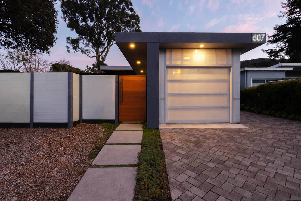
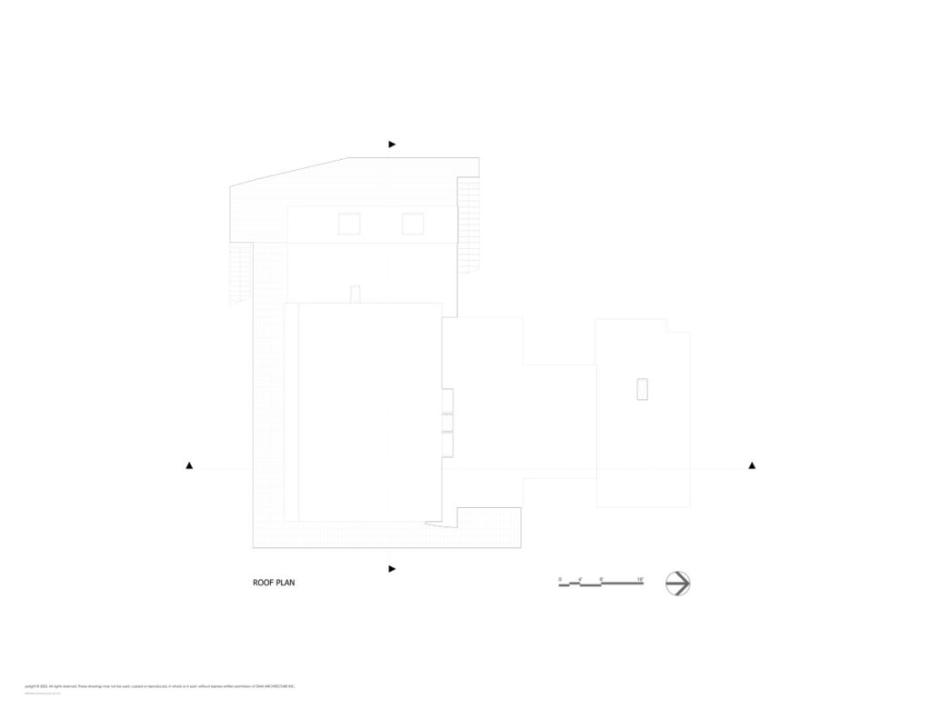
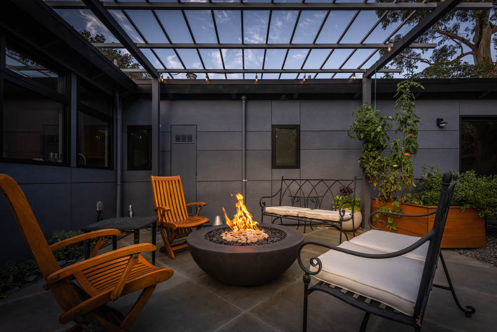
The home is set back from the street and had an attached carport in line (flush) with the front façade. David recognized the opportunity presented by the physical positioning of the home: absorb the carport space into the interior and add a one-car garage to the front. This, in turn, presented the opportunity to create a front courtyard, which allowed for larger windows to be added to the front of the home with the ability to retain privacy.
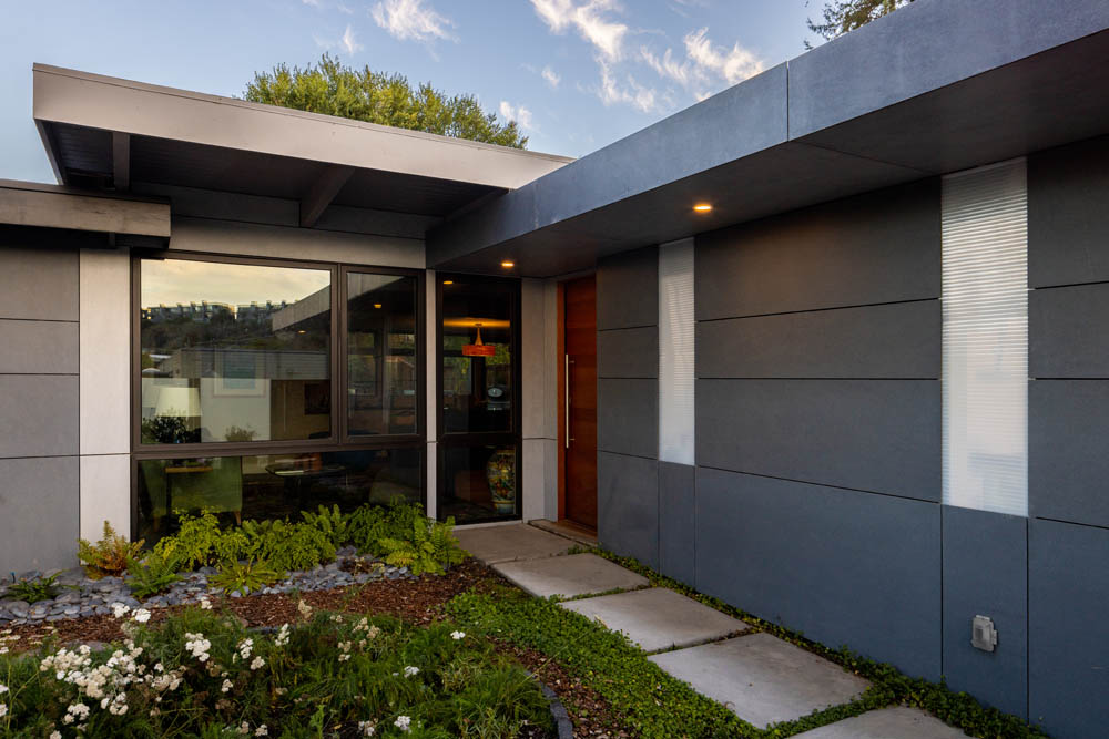
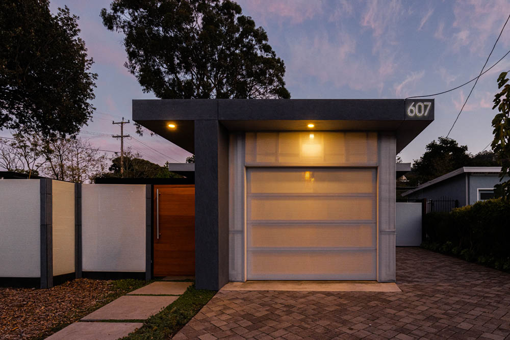
Exterior materials were kept to a minimum: Patina fiber cement panels from American Fiber Cement Corp. were applied to the home, and Polygal insulated polycarbonate was used for the front and side of the garage. The polycarbonate is semi-translucent and creates a glowing “lantern” effect of the garage at night, adding the possibility of dramatic lighting to the curb-appeal of the finished project.
DNM Architecture uses a guiding principle in all their work: the front entrance to the home should be the main entrance for all who arrive. In this case, a small foyer receives all arrivals from both the garage (family) and the front door, which has been relocated and repositioned.
The foyer wastes no time pulling all who enter into the magnificent new living space. The exterior carport walls have been knocked down and combined with the existing living room and kitchen to create a contemporary open space for everyone to relax, socialize, cook, and eat.
The original kitchen was long and narrow, with an oddly-placed small door at the far end, allowing the only access to the side -not rear- yard. The new kitchen is fully open and features a slightly altered layout. An island sits front and center, featuring gorgeous blue tiles from Heath Ceramics and topped by a quartz countertop.
Along the back wall are a butcherblock counter and the appliances (KitchenAid, Bosch, Dacor) which accommodate the couple’s love for cooking. Over the new sink, multiple, larger windows have been added; a new glass door, repositioned where it makes much more sense, provides direct access to the backyard. The new layout brings lots of southeastern morning light in through those windows and door. On the wall where the side door used to live, the couple now has prodigious kitchen storage and the refrigerator.
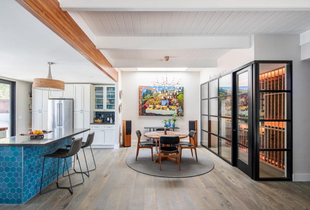
The architectural redesign also created a new focal point for the newly-open living space. When the carport was incorporated into the inside of the home, the roof had to be restructured and properly supported. Rather than use any old beam and hide it, DNM opted to make an expression out of the new structural support and used a Douglas fir glue laminated beam that has been sanded and finished to complement the butcher block counter and other wood tones found in the home. This standout feature adds a splash of color and breaks up the expansive clean white ceiling.
The new interior space (formerly carport) is now home to several other great features. This first is visible upon entering the home – a bespoke “wine cellar” to showcase the owner’s passion for a local specialty! It was imperative that they had a storage area for their collection, and they wanted them properly displayed – not hidden. Using the space provided by David’s new layout, the owners designed and built a sleek and stylish, fully-enclosed temperate zone made of stained oak and glass built adjacent to the garage wall.
Another standout feature was borne out of necessity. While light does come from the kitchen and the adjacent living room (via large front windows), the dining area still felt dark. To fix the lack of light, a skylight was placed in the corner to allow sunlight to flood in from above and utilize the white wall as a reflector, filling the space with warmth.
And for those times when natural light isn’t on offer, every modern dining room needs an amazing light fixture over the table. A Moooi Heracleum II – a new modern classic often seen in David’s designs, adds some more light and unparalleled style to mealtime.
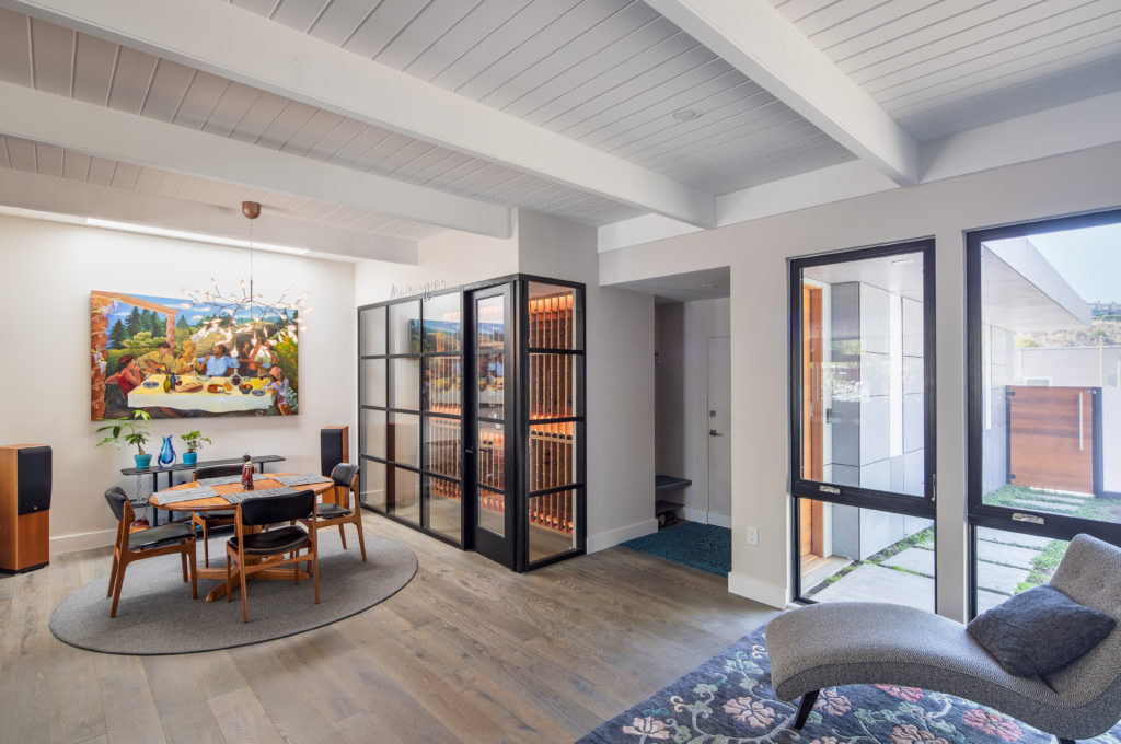
White oak flooring was one feature of the previous renovation that worked with this latest reimagining, and fortunately, there were materials leftover from the construction. When the carport was transformed, DNM Architecture was able to match the existing floor using leftover materials to provide a seamless integration of spaces. Visiting the home with no prior knowledge of renovations, one would assume the interior living space was always this large, and not a reclamation of exterior space.
Lise and Vincent have recently made their own improvements in the backyard, continuing David’s architectural vision and aesthetics. They have added a built-in barbeque and a tiny, detached studio, and landscaped the yard into a gorgeous outdoor living space.
DNM Architecture transformed the living space in this home from a small, cramped, dark space to a bright, open, beautiful comfort zone. Seventy years after the original build, this older home is now a gorgeous shining example of what Mid-Century Modern can look like in the 21st century with smart, thoughtful planning and design.
