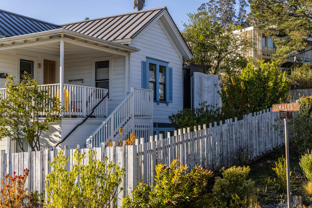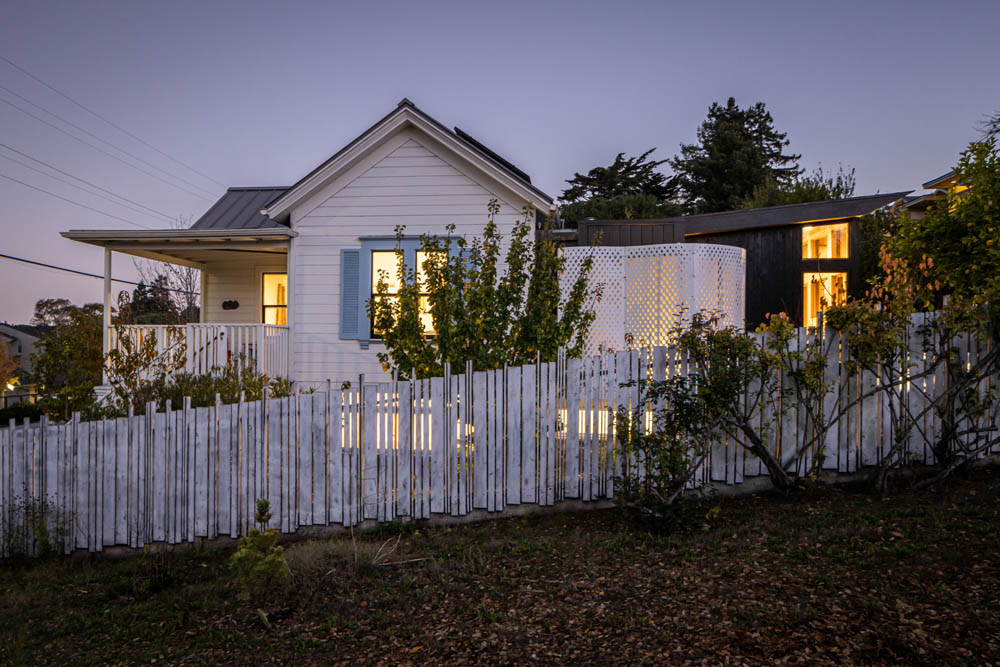
The home of this architect and artist couple is a continuously evolving laboratory.
+Read the DWELL article then come back for a longer look.
Architect David Marlatt, AIA (principal, DNM Architecture) and his wife Sarah Burgevin, a ceramics artist and teacher, bought what could be kindly considered a “fixer upper” in 2014. The original structure dated from 1906 and was originally sited on land closer to the water. When the Army came in during World War II and consumed the neighborhood for the Marinship Shipyards, the home was moved to its current location – a corner lot in a quaint neighborhood in Sausalito, with easy access to the city just across the famed Golden Gate Bridge. Over the ensuing decades, the home received a couple of small additions that were hardly more than sheds attached to the house, and a series of low-cost renovations inside that lowered the ceiling to 8 feet and covered the walls with cheap 1/8” plywood, converting the space into a relatively nondescript rental house.
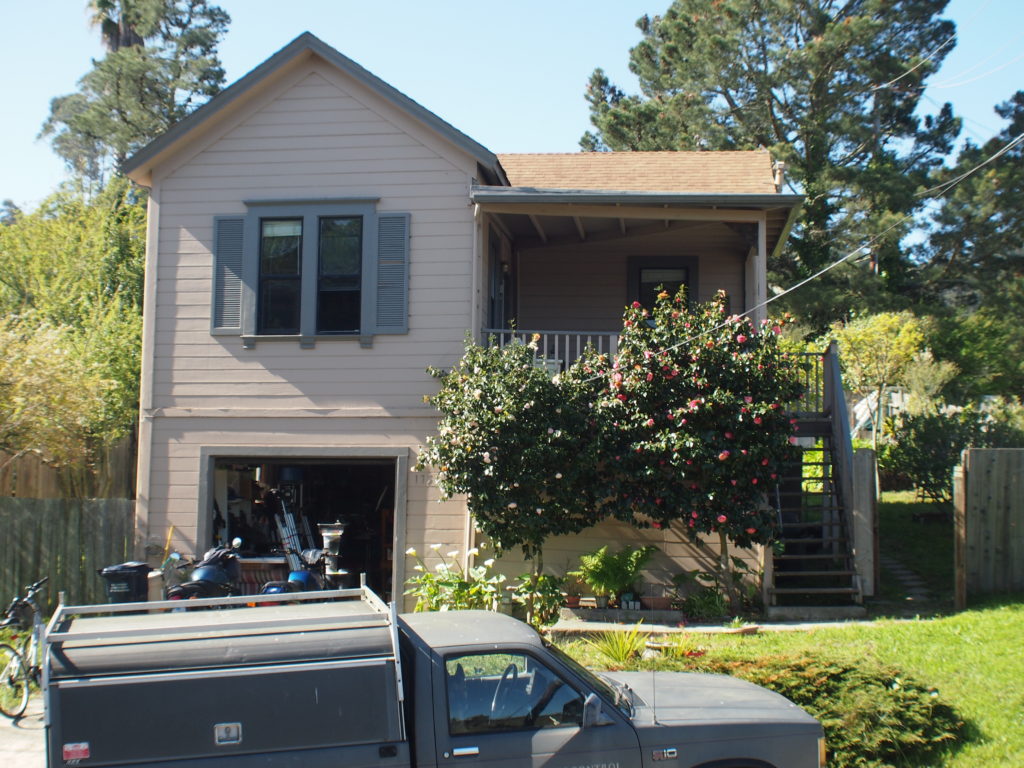
When they acquired the property, David and Sarah decided to work in phases to get everything done properly, at a convenient pace, and on the right budget. The couple tried new options and experimented with materials throughout the home to achieve a desired look and feel – with an eye towards discovery and efficient costs. As a result, the home is somewhat David’s laboratory of design experiments, many of which have subsequently been incorporated into projects for other clients.
Beginning with a swift interior renovation to prepare the home for move-in within 30 days, immediate construction began with the walls, floors, and ceiling. When the unnecessary dropped ceiling was removed, two feet of extra head space was discovered. Beyond that, in the entrance sitting room, the ceilings were completely removed to expose the original rustic redwood roof framing, giving an incredibly open feel as one enters the home through this small front room. Throughout the rest of the home, the dropped ceiling was removed, and the original tongue and groove redwood ceiling was refinished and brought back to great condition.
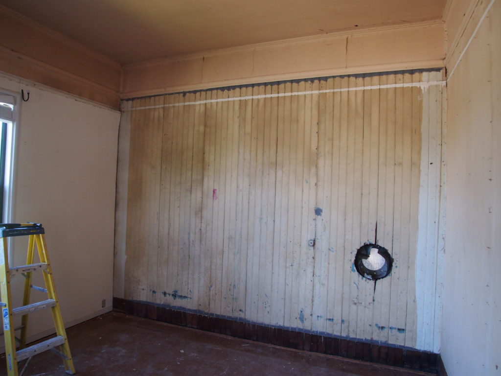
Beneath the cheap plywood wall paneling, David and Sarah discovered original 7/8”-thick tongue-and-groove redwood. With lots of elbow grease to remove glue and wallpaper, it was brought back to its original state and painted white. In fact, all interior walls and ceilings have been painted white to provide a bright interior with no dark corners.
Unfortunately, the original floor could not be saved once the vinyl was peeled back. An engineered Cherry hardwood was selected for the new floor. The slightly darker color contrasts with the white interior and has proven to be a great choice made under budget and time constraints.
The final part of Phase One concerned all the doors in the house. The front door was replaced entirely, while interior doors were stripped and given a protective coat rather than new finish to provide splashes of character throughout the home.
Then, with David and Sarah living in the home, it was time to tackle the rest of the spaces!
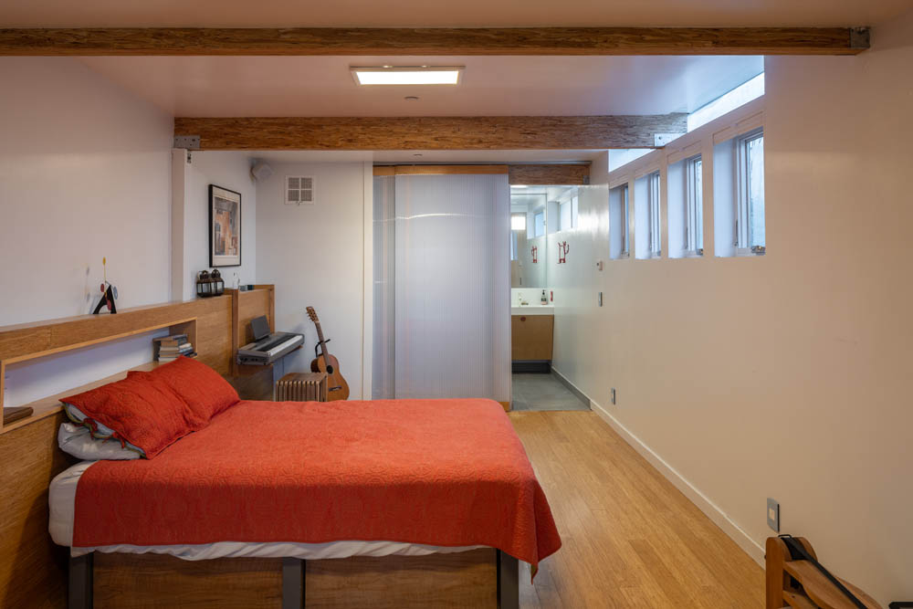
The home as purchased was small at just 875 square feet. All of the living space was on one floor that sat above a single-car garage and an unused crawl space. David’s team excavated the entire non-garage area under the home and added 400 square feet of livable space built out as a guest room and full bathroom. For the privacy of both homeowner and guests, the new space has its own front entry and no internal stairs. It is equipped to have a small kitchenette installed (e.g., for a rental space), but for now David and Sarah have opted to keep it a guest room.
A lovely, engineered bamboo floor was put down and extended up a side wall to hide the rough concrete foundation. Polycarbonate, a translucent material and signature element in DNM projects, was used for sliding doors that reveal a walk-in closet on the left and the full bathroom on the right. The experimental use of this modern, lightweight material for this specific job has yielded excellent results as light can filter through into the bathroom and windowless closet, bringing amazing natural light into what was formerly nothing more than an under-floor crawlspace!
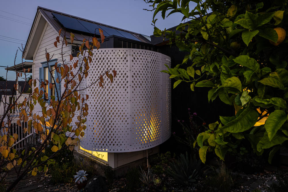
When the basement bedroom was excavated, the bathroom was pushed into territory that had no house above. That’s where Phase Three started: the master bathroom was placed strategically above the new downstairs full bathroom. This completely new space is small for a master bathroom at just 60 square feet, but it is entirely open and properly designed to feel much larger. The shower has no interior walls and has been placed in the corner of the room.
Another of David’s experimental ideas has paid dividends in this new space. The adjoining exterior walls in the shower corner are tall windows that slide open to a small, enclosed garden. In a further design experiment and materials test, the bathroom ‘box’ was wrapped in perforated aluminum panels in a curvilinear shape. Result: the panels provide complete privacy while the windows allow the shower to be open to the outside for that amazing California outdoor shower feel.
Final touches to the new master bathroom include exterior siding on the interior wall to mark the new addition, a new custom vanity, and a fun photo mural behind the wall-mounted toilet.
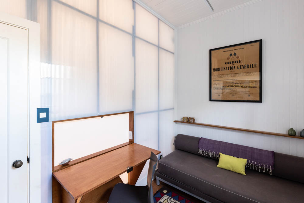
On the other side of the home, a small room that had served as a bedroom in the rental years was noticeably better suited as a study/office. The drywall on the interior hallway wall was removed and replaced with polycarbonate to allow light to pass from the bedroom’s eastern windows in the morning to the hallway; when the morning sunlight disappears, light is able to come back into the study from the rest of the home. To maximize the space and potential of the room, David designed and built a unique fold down desk into the wall providing a space to work that can be folded away easily when finished.
Throughout all phases of the renovation, exterior changes and alterations were made to the home. The roof was replaced with a more durable standing seam metal, and all foundations (except the garage) were updated to modern, code-compliant, seismically-appropriate supports. The exterior has been painted white, a new fence (also white) has replaced the rickety old one, and the porch has been 100% reconstructed, purposely retaining the original look.
Keeping the original house expressed as a restoration in the front was a conscious choice, knowing that Phase Four would bring about a huge change in the back. The old ‘shed’-style addition was completely removed, and a new modern structure was built and married to the older home. The new addition has a roof that slopes slightly upward towards the southwest-facing backyard to expand the view and capture as much sun as possible through a wall of glass. Another design idea that was tried here first is found at the end of the roof: stainless steel was used to give the edge of the roof a unique “knife edge” look that is truly sharp.
The siding was an experiment in both cost savings and creativity, designed to achieve a specific desired look: inexpensive incense cedar fence board has been installed on furring as siding and stained in ebony to mimic the look of shou sugi ban, a gorgeous Japanese charred wood – at a fraction of the cost.
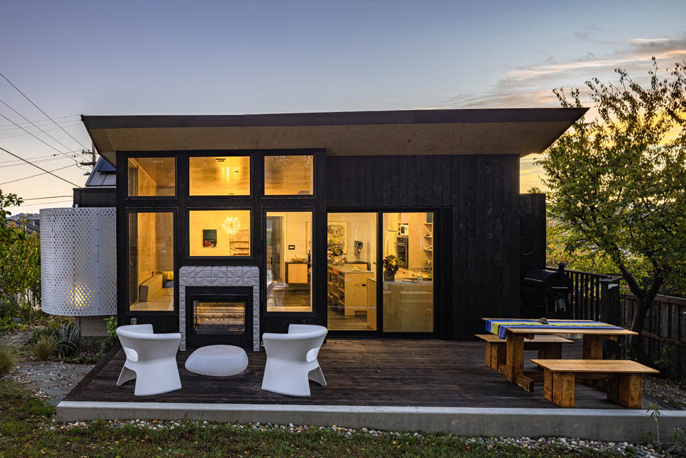
To this end the home sharply contrasts old and new in its color scheme of white and black. From the street, passersby notice the old, restored structure beaming in white clapboard, and the new, modern structure glowing from behind the dark exterior. Metaphorically, the two buildings look as though they are locked together in conversation.

The weathered, old deck was completely replaced with a more spacious patio of Pakari thermally modified wood, a fantastic green alternative to IPE or cedar. This was another ‘try it first here’ for David, before using on future projects.
A highlight of the exterior window wall is the double-sided fireplace, which can be enjoyed from either side. On the patio side, seating by the fireplace makes a great spot for an outdoor dinner or an evening cocktail.
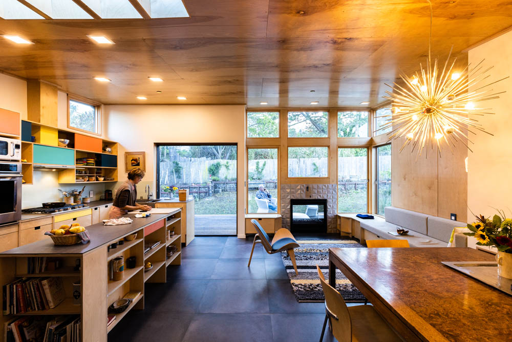
The spacious living area of the new addition is the heart of this re-imagined home. It is organized into three subspaces: a relaxing, cozy corner for conversation by the fireplace; an eating area lit by a gorgeous ‘70s-era sputnik satellite lamp which David and Sarah found in a Los Angeles junk store and restored; and, finally, fully half of the space is devoted to a custom, open and modern kitchen which David built using clear-finished Russian Birch plywood, grey Neolith sintered stone countertops, glass backsplash and highlights of color.
The floor has been laid with 32” square porcelain ceramic tiles for a rugged but warm finish. The walls and ceiling are finished with beautiful birch plywood, a wood with enough tone and texture to provide depth, while providing a nice base canvas for Sarah’s ceramic artwork which highlights the space. The light wood tone also contrasts beautifully with the dark exterior shell of this new volume, like the nacre inside of a dark oyster shell.
Last but not least, a double-width pocket door slides completely out of view to maximize the indoor/outdoor connection of the two spaces.
A pantry and laundry room sit tucked behind the kitchen. Adjacent to that space, a second full bathroom was constructed and features pure cement plaster to achieve a curved wall shower finish – yet another design experiment David tried here first. To mirror the master bathroom on the other side of the house, the second bathroom has also been wrapped in the perforated sheet metal.
David and Sarah also employed eco-conscious strategies into their new home. Rainwater from the new roof is collected in a large 600-gallon pillow tank in the basement and used for irrigation. Additionally, water from the shower and washing machine is diverted directly to the landscape. Finally, between modern insulation practices in the small home and the collected solar energy from a 2.2kw photovoltaic array, the home’s net electric usage is almost zero.
The search continues to pay dividends both for the homeowners and for David’s clients today!
